Update: Some commenters on the ‘net did not agree with a graph that combines gas and oil. Fair point. I’ll redraw the graph to include only crude oil.
The new graph does not change any comment made in this post. It stands as is.
Peak oil is still a failed concept.
Here is the new graph:
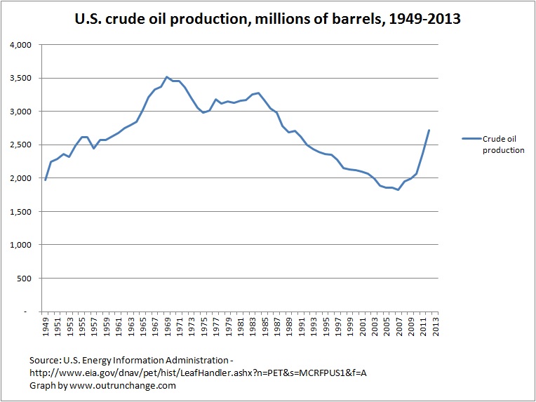
Again, here is the main question: Where is the inverted V drop after the peak that mirrors the runup to the high point?
Answer: It isn’t there.
2nd Update: I appreciate folks pointing out the error of my ways. Further research produced the above graph which makes the point yet again. I also looked at natural gas production.
The fail of Dr. Hubbert’s theories is even more extremely illustrated by graphing natural gas production. Comparing actual to his predictions is staggering. Another post on Monday.
Two busted Hubbert theories from one post. Peak Gas is even more of a fail than Peak Oil.
3rd update: Further discussion of the Peak Oil graph on the following post.
Original post:
Saw a graph containing production of oil and gas in the U.S. since 1950. Since that one is copyrighted, decided to make my own.
Check out this graph of the amount of crude oil, natural gas (dry), and NGPL from 1949 through 2013:
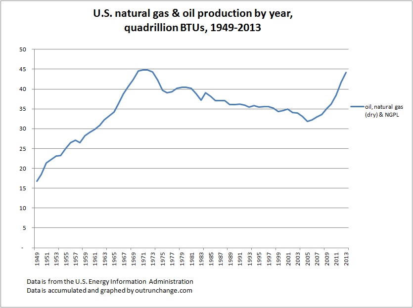
Now, please look for the permanent, inevitable decline trending to zero after the never-to-be-achieved-again peak oil point of 1970. Also look for the inverted-V shaped drop after the peak that mirrors the runup.
You can’t because it isn’t there.
It isn’t there because the Peak Oil doctrine is wrong.
It has always been conceptually wrong. For several years now there has been data to prove it.
The 2013 total is 44.1 quadrillion BTUs. The previous high point was 44.9 in 1971.
The 2014 data will show another increase. As a wild guess, it will blow past the 1971 amount.
Technical note – The data from EIA for total production in BTUs only runs through 2011. For the 2012 and 2013 data, I pulled the oil, gas, and NGPL production data from different tables, adjusted to BTUs, and added the data. If you wish to show a different graph, please provide a link.
While graphing away, I decided to look at the amount of energy from solar and wind. Here’s the total energy production in the U.S. and the amount from solar/PV and wind:
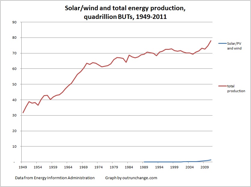
See that line at the bottom? Check again. It’s there. The line that departs from the horizontal axis is solar and wind production.
The blue appears when the data goes non-zero. In 2011, solar makes up 0.20% of total production and wind is 1.50% for a total of 1.7% of all energy produced. That is an increase from 0.10% and 0.37%, respectively, in 2006. Ten years earlier, in 2001, production was 0.09% and 0.10%, respectively.
Here’s another way to look at it. Total solar and wind production in 2011 was 1.33 QuadBTU (is that even a legit abbreviation?) in comparison to the 1.99 QuadBTU increase of crude oil production in 2013. Wind and solar total in ’11 was only two-thirds of oil increase in ’13.