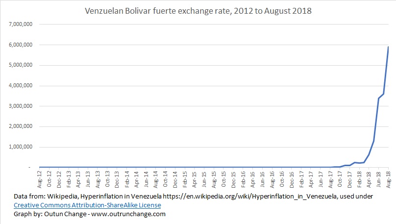
Let’s look at the exchange rate in Venezuela in more detail, breaking out the exchange rate before and after 2018. On the previous graphs it looked like the exchange rate deterioration wasn’t that bad in the lead up to 2018 and it looks like things turned real bad starting in 2019.
That’s the weird thing about hyperinflation. If you remove the recent severe acceleration you still see the rapid increase earlier.
Graph at the top of this post shows exchange rate through 2018. It looks like hyperinflation kicked off in early 2018. Actually, it was going crazy before that. Inflation so severe as to destroy the economy has been running since 2012. Let’s change that graph above to a logarithmic scale to show the percentage changes better.
By the way all data in this post is from a Wikipedia article, Hyperinflation in Venezuela. This means the information for this post is used under the Creative Commons Attribution-ShareAlike License. I can use the information, modify it, adapt it, share it, or distribute it, even commercially if so desired.
The of that licensing permission is that anything created from this data must be shared with others under the same license. So, the information in this blog post, but only this specific blog post, may be used by anyone under the Creative Commons Attribution-ShareAlike License.
Switching to a log scale shows:
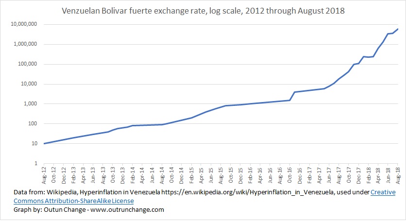
You can see there is a severe inflation rate from 8/12 through late 2016 at which point the inflation rate increase more severely.
In case you think that inflation in 2012 through 2018 wasn’t all that bad, let me give you another illustration.
Imagine some small basket of goods that in 8/12 cost you 10 Bolivar fuertes. Here’s what that little basket of stuff would cost you at a few later dates:
- 10 – 8/12
- 70 – 1/14
- 200 – 2/15
- 900 – 12/15
- 4,000 – 11/16
- 111,000 – 12/17
That’s what the not-too-severe inflation was running from 2012 through 2017.
Now this look at the exchange rate from the end of 2017 to the end of 2019, in six month increments:
| Dec-17 | 111,000 |
| Jun-18 | 3,400,000 |
| Dec-18 | 73,000,000 |
| Jun-19 | 788,000,000 |
| Dec-19 | 5,470,200,000 |
Imagine the devastation that would have on poor people and middle-class people. Even the extremely rich would be destroyed by that kind of inflation.
What cost you 10 Bv.f in 8/12 would cost you 111 thousand in 12/17, 73 million in 12/18, and a whopping 5.4 billion in Bv.f equivalent in 12/19.
Absolute devastation.
But wait. The government was not about to drop socialism.
Here is the exchange rate from 8/18 through 12/20. In 8/18 the government swapped out 1 Bolivar soberano (Bv.s) bills for 100,000 Bolivar fuerte (Bv.f) bills. That stripped five digits off the currency and all prices. For consistency of the graphs, the units are converted to the equivalent number of Bv.f, in other words adding those five digits back on. This allows us to keep perspective in relation to the 2012 timeframe.
The exchange rate from 2018 through 2020:
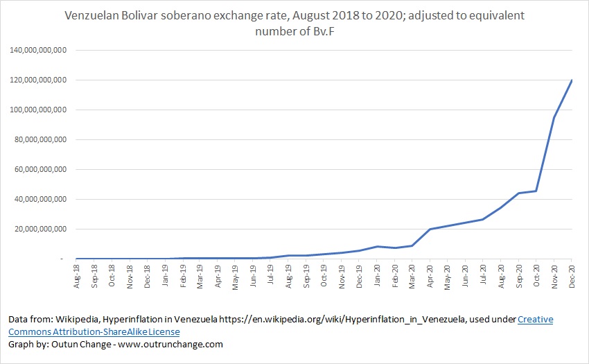
It went from about 5 billion to 120 trillion in that timeframe. Notice the graph still looks like a hockey stick.
Let’s look at it on a log scale:
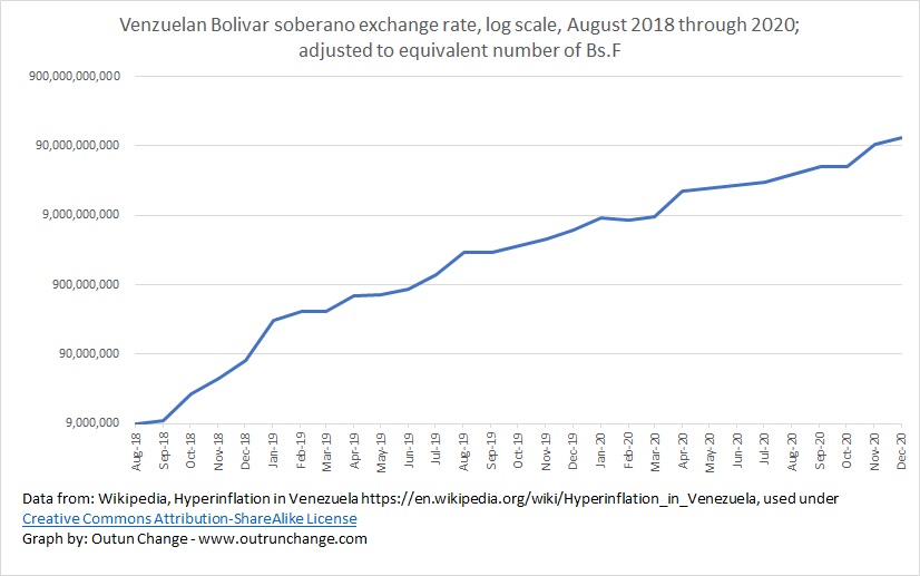
Exchange rate went from absolutely brutal in 2018 to a mere devastatingly destructive in 2019 and 2020. Since early 2019 it looks like it has been a relatively consistent percentage basis. Still devastating but not accelerating at least.
As previously mentioned, the information in this blog post, but only this specific blog post, may be used by anyone under the Creative Commons Attribution-ShareAlike License.
Next post: combining two sets of data for a graph of 2019 through 2021 exchange rates
See also: