The change in oil production in the last few years is astounding. For perspective, look at the following two charts by Prof. Mark Perry, from his Carpe Diem blog. Both graphs used with permission:
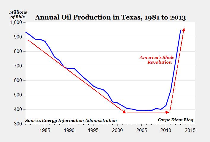
Oil production in Texas:
From The remarkable rise of Texas crude oil: The state produced nearly one billion barrels last year, and 34.5% of all US crude. Just under a billion barrels. That’s around a third of US production.
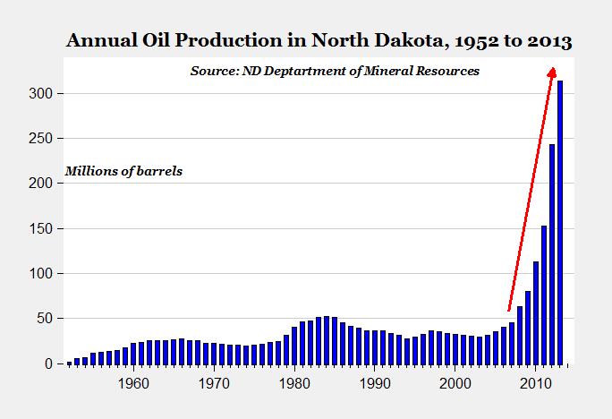
Oil production in North Dakota took off in 2008:
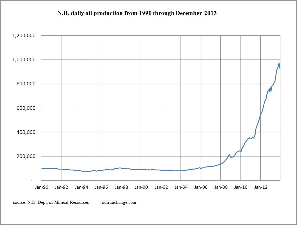
Here’s my graph of North Dakota oil production by month since 1990.
Oil production in North Dakota isn’t recovering from a long-term slide like Texas. The graph of production in Texas looks like a U or a backward check mark. Production graph in North Dakota looks more like a rocket.
And there are more fields that will likely have long-term production graphs that look like the above two states.
As the good professor often asks: Peak what?


