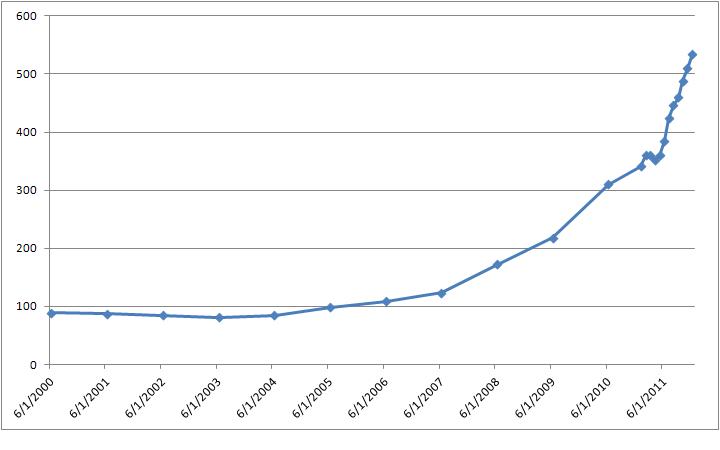
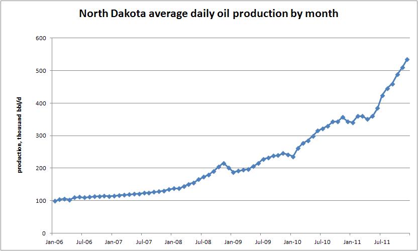
After reading about oil production in North Dakota surpassing California here, I pulled some data from the U.S. Energy Information Administration here. Created a couple of graphs.
Took the annual average daily production in North Dakota for 2000 through 2010. Added the average monthly production for 2011. Came up with this graph.
Click to enlarge. Comments – data is thousands bbl/d. Labeling convention is mid-year for annual data and mid-month for monthly data.
Then I found the monthly data. Check this out:
Is that cool or what?


One thought on “Graph of North Dakota oil production”