If you want to see what a radical change is underway in the energy field, check out this graph of combined oil production from the three biggest plays, Bakken, Eagle Ford, and Permian:
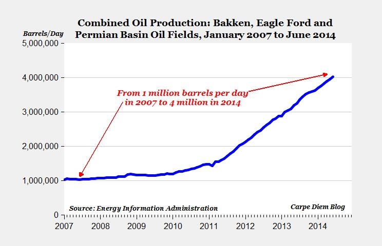
That’s from America’s Amazing Shale Revolution in one chart by Carpe Diem and is used with permission.
Oh, ‘bout that mention of Permian? Remember that is the ancient, used up, drilled out, declining, has-been field in Texas.
That is, it was until the energy wizards added in horizontal drilling and hydraulic fracturing. Now it is a booming field like Bakken and Eagle Ford.
Check out the detail for those three fields by themselves, from the same article and also used with permission:
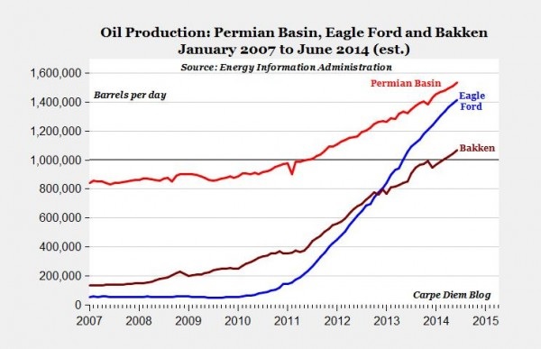
Just eyeballing the graph, it looks like the drilled-out Permian field through the estimate for 6/14 is up about the same as Bakken production increased through mid ’13.
The Permian Basin trend line isn’t as dramatic as the others because its starting point on the graph was about 4 times higher than Bakken and about 8 times higher that Eagle Ford.
I’ve been cheering on both fields in the Bakken vs. Eagle Ford race. I favor Bakken because that’s where our son is living and working. After looking at this graph, I guess I might have to, maybe, eventually, concede that Eagle Ford is winning the ‘horse race.’
Actually, there’s no losers in this race. Every person in the U.S. is a winner because of what is going on in Bakken and Eagle Ford. And Permian Basin.
Here are three words often used by Carpe Diem which the good professor ought to copyright (if it were actually possible):
- Petroprenuers.
- Saudi America.
- Carpe oleum.
What Peak Oil?
Check out the comments at the linked article if you don’t believe me when I say the Peak Oil true believers are alive and well. They are constantly redefining Dr. M. King Hubbert’s faith-based doctrine that we will run out of oil and we can chart the exact curve of all oil production and therefore they can calculate when we will run out. Which will be any day now.
I read another blog over the weekend by a Peak Oil true believer. The graph above would be proof that we will hit Peak Oil any day now. Author of that blog graphed the North Dakota production and added a biased trend line. The resulting view suggests we are at the peak for Bakken. The inference is that within a month or two production will drop and the field will fall into a long, permanent, inevitable decline.
Check out any of the graphs from Carpe Diem. Then ask yourself this question: What Peak Oil?