While researching for my post, Encore question: What Peak Oil – #36, I browsed a bit more of Dr. M. King Hubbert’s 1956 paper, Nuclear Energy and the Fossil Fuels, which you can find here.
In addition to a precise calculation of the total crude oil that will be extracted through 2050 from Texas, the U.S. in total, and from the entire planet, he also made some calculations for natural gas.
In Figure 22 on page 32, he calculated the production curve of natural gas in the U.S. through 2075, at which point production is indistinguishable from zero. The calculations are to three significant digits.
The graph is based on the same logic and analysis as Peak Oil. Namely that the total amount of a resource that will ever be extracted can be calculated and the production curve graphed with reasonable accuracy. There will be a peak followed by a slow, inevitable, unavoidable decline to near zero. When the production turns a corner at what appears to be the peak, 50% of the total that will ever be extracted has been pulled, which means roughly the same amount will be extracted in the future.
That concept applied to natural gas is a complete failure for the same reasons as Peak Oil is a failure.
The conceptual reasons are discussed in the series of posts addressing What Peak Oil?
A graph showing the failure of Peak Natural Gas is more dramatic that the graph of Peak Oil.
Graph of actual production and Dr. Hubbert’s prediction.
I pulled the natural gas (dry) and NGPL data from EIA for 1930 through 2011.
I don’t have the raw data for the curve Dr. Hubbert drew and don’t have the software to calculate the curve.
So I pulled approximations from the graph in Figure 22. Made estimates for 1925, 1934, 1950, 1956, 1971, 1972, 1973, 1975, 2000, and 2025. Then I interpolated the years between those data points.
The resulting graph I drew is visually comparable to Dr. Hubbert’s graph in Figure 22. Specifically, the 1956 data matches, the peak is around 14T in the mid-‘70s, and the 2000 data point is below 8T.
If you have more accurate data, let me know and I’ll redraw the graph. As a rough comparison, I’ll bring in another graph in a moment.
So, here is the comparison of actual production to my rough redrawing of Dr. Hubbert’s prediction:
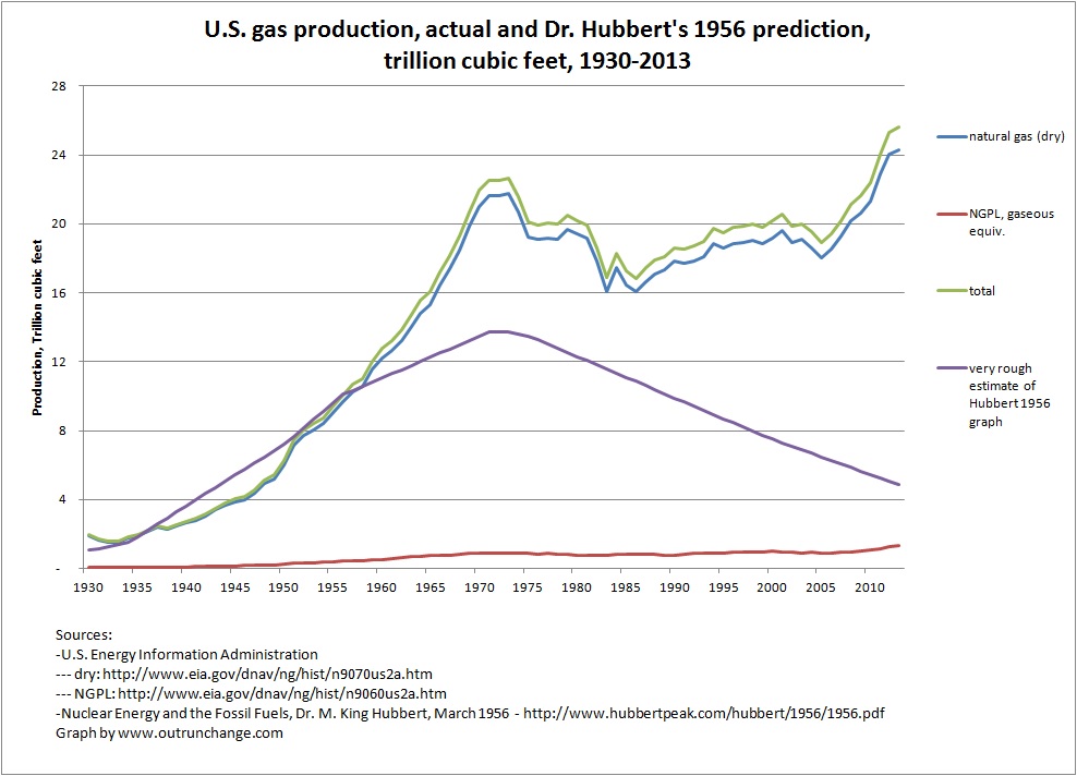
Please, please don’t take my word for it. Please check Figure 22 for yourself.
Can you say busted?
That graph (and theory) was busted before fracking even came along. Here’s just a few busts:
- production over the next 15 years was far larger than proven reserves in 1956
- the actual high point of dry gas was 59% higher than his prediction
- after the temporary high point in 1973, production only declined until 1983 (10 years) instead of forever
- after 1983, the actual production level wanders but overall the trend is up instead of a steady decline toward zero
- production in 2013 is about 5 times Dr. Hubbert’s prediction
This is not a straw man
You may think I’m making this up just to shoot down an already invalid idea nobody is pushing.
Not so.
Check out the following Wikipedia article for a quite serious discussion of the day we will run out of natural gas, which will be very soon:
Do a little searching on the ‘net and you will find more discussions of Peak Gas. Not as much as Peak Oil, but it is there.
Another graph:
While poking around at the Wikipedia article, I came across a graph that compares the Hubbert curve and actual production.
The graph was developed by Plazak. Used by permission. Full credit below the graph.
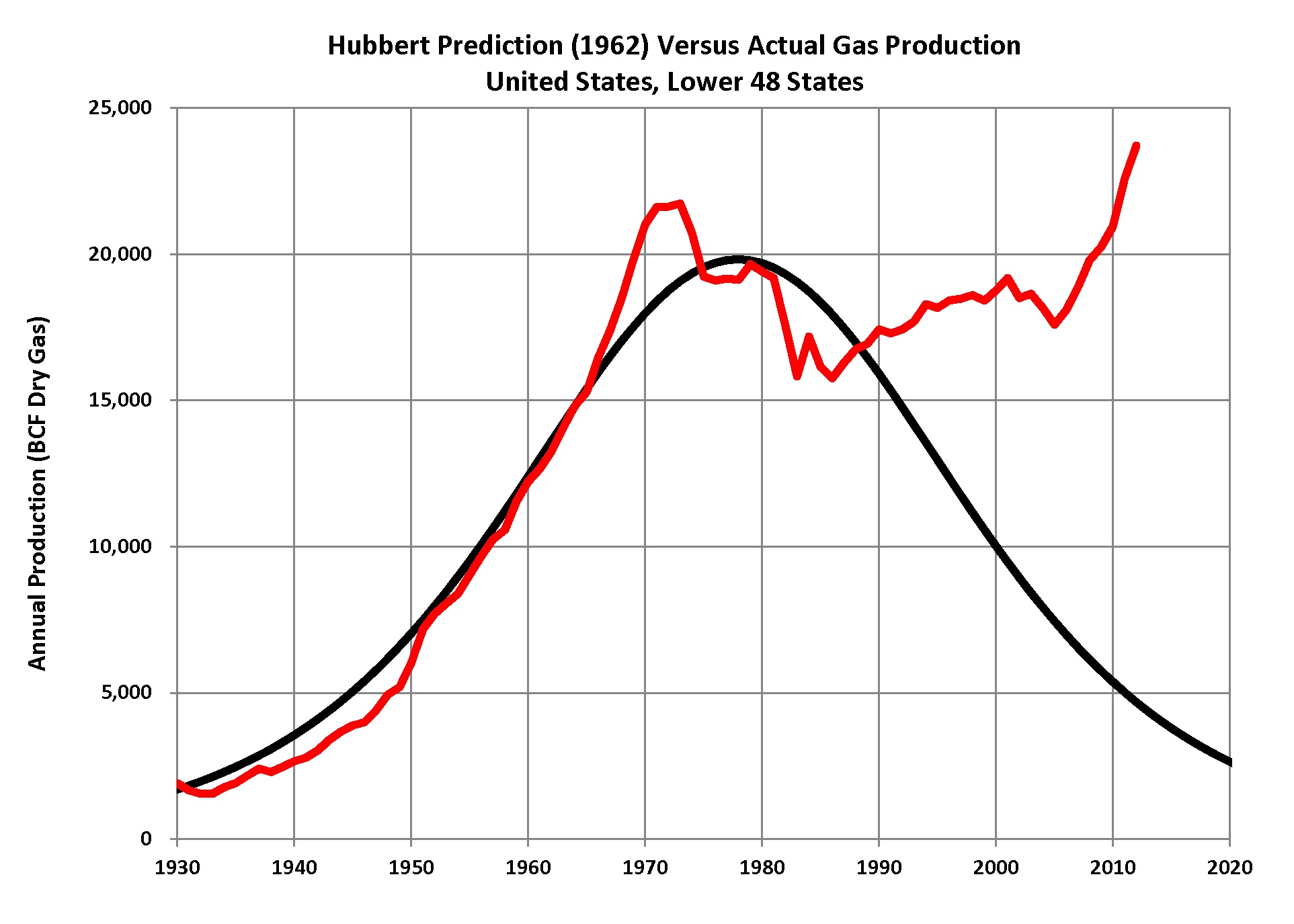
Credit: Hubbert US Gas by Plazak – Own work. Licensed under Creative Commons Attribution-Share Alike 3.0 via Wikimedia Commons – Link: http://en.wikipedia.org/wiki/Peak_gas#mediaviewer/File:Hubbert_US_Gas.png
The actual production in this graph validates my graph above. The general shape and year of the high point in the graph is roughly comparable to mine.
The graph from Plazak has a severe flaw. The peak from Dr. Hubbert’s Figure 22 is about 14T, not 20T. Even with that, the divergence between forecast and actual is severe. The radical change in direction starting in the early 1980s is still quite obvious.
Looks like my rough graph was quite on point.
And again, even with a flawed graph, can you say busted based on the Plazak graph?
Update: After looking at the Plazak graph a few more times, I’m wondering if the graph is intentionally reducing the astoundingly severe errors in Dr. Hubbard’s graph. The Plazak graph moves the peak to the right a couple years from the Hubbard curve, which is a few years off from the actual peak. The peaks don’t match by almost a decade. The high point on the Plazak graph is overstated by about 6 trillion cubic feet, or about half. That is an extremely material error. The remainder of the graph since around 1990 still shows Dr. Hubbert’s theory to be an order of magnitude beyond invalid as a predictive tool. Yet the net effect is to make the Hubbert prediction look like it has some sorta, kinda, vague correlation to actual production instead of being a complete failure.
Fallacies
There are many fallacies built into the concepts of Peak Oil and Peak Gas.
What are a few of them?
- We will never find another big field. (think Alaska)
- No field we know about will ever be found to be larger than we think. (think every field that exists)
- The petroleum engineering wizards will never figure out a way to get more out of the ground than is technologically feasible today. (think horizontal drilling & hydraulic fracturing, refracking soon, and before that secondary recovery, tertiary recovery)
- Higher prices will never make oil/gas that is economically unfeasible to drill today worth drilling in the future. (think Bakken and Eagle Ford)
- Nobody will ever consider substituting one product for another when relative prices change.
- The total amount of future production can be calculated based on past production plus proved reserves.
Any one of those or other fallacies not mentioned will wreak havoc on peak theories or any other neo-Malthusian concepts.
For the Peak Something theories to be valid all we have to ignore is economics and technological innovations. Essentially, we have to assume away human ingenuity.
Can we finally stop talking about Peak Oil and Peak Gas?
Update: I am continually amazed at the reverence given to Dr. Hubbert’s methodology and predictions as I browse the ‘net. The Gospel message from Dr. Hubbert in his 1956 paper is that total production of dry natural gas in the U.S. would be 850 trillion cubic feet at the point we used the last cubic foot. From 1930 through 1999 the U.S. produced 861T cubic feet. Did we run out of natural gas in 1999? No. In fact, since then we have pulled an additional 285T cubic feet.