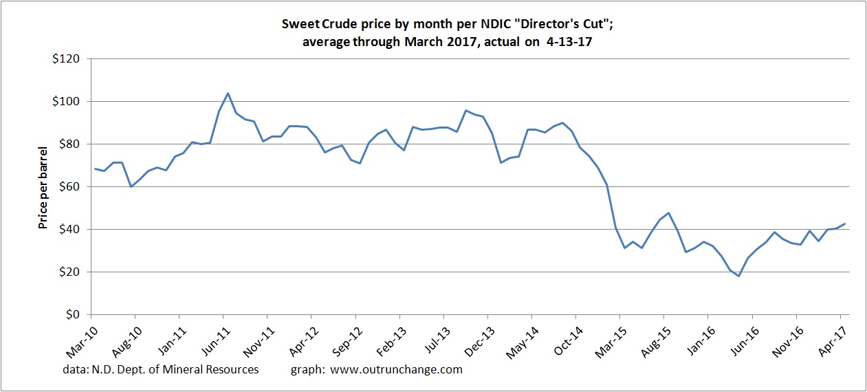
If you want to see one graph that explains the swings of drilling and oil production in North Dakota, take a look at this:
The price of oil for producers in the state collapsed in late 2014 due to the OPEC decision to increase production. The price recovered a bit in mid-2015 but continued to drop into the 20 something range.
The price has been steadily trending up, albeit slowly, since mid-2016.
That graph can then explain a lot of other trends.
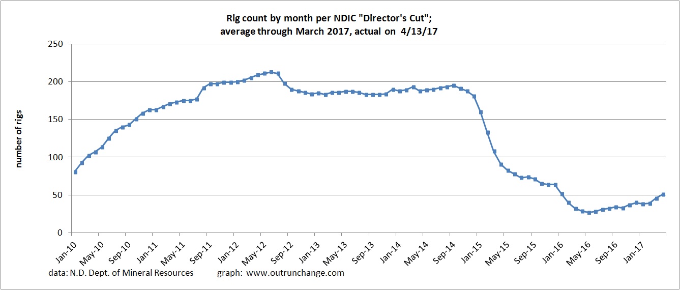
For example, look at the count of average rigs in operation. The tally dropped dramatically in 2015. It has slowly been recovering since fall of 2016.
That swing is driven by oil prices.
Keep in mind as you consider that chart that the productivity and efficiency of a well has increased dramatically in the last few years. The number of days to drill a well has dropped, the cost per day has dropped, and the oil produced from a well has increased.
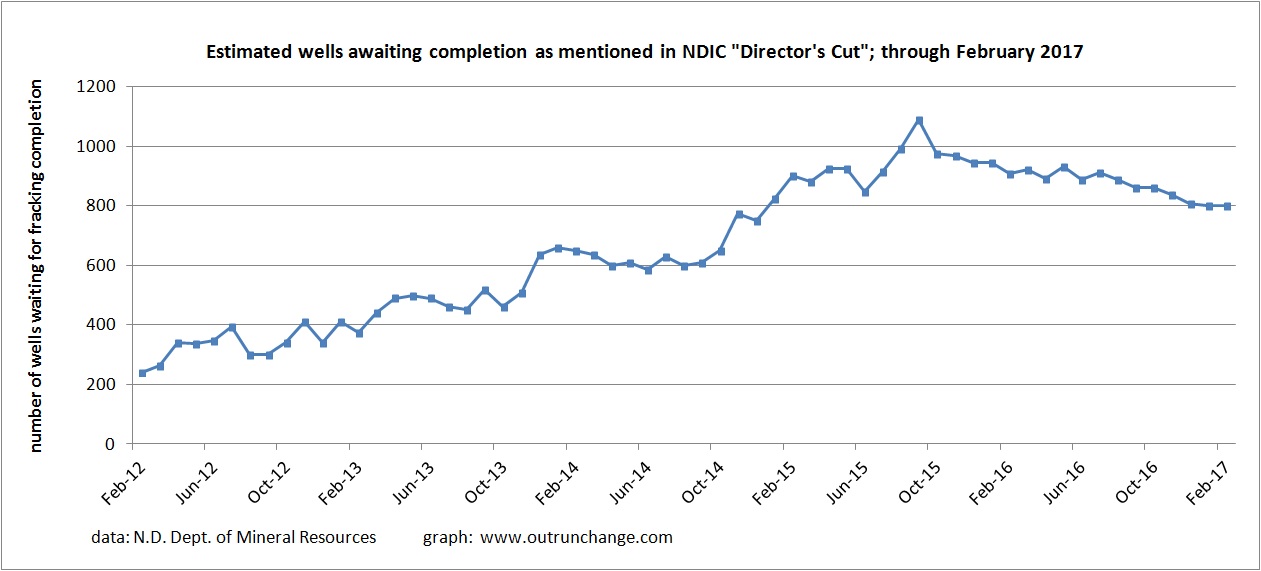
One final graph to consider is the fracklog, or wells that have been drilled but still need to be fracked. Consider this a tally of almost ready to produce wells that are stored on an inventory shelf.
A large inventory of uncompleted wells built up in 2015.
That inventory is slowly being worked off. A substantial increase in price would pull a lot of those wells on to the market in short order.


