Gross World Product, according to Wikipedia is
the combined gross national product of all the countries in the world. Because imports and exports balance exactly when considering the whole world, this also equals the total global gross domestic product (GDP).
I got curious about the world-wide GDP after thinking about two previous posts:
What would happen if you multiplied the drastic increase in population with the radical increase in per capita income? I made a feeble effort to multiple the two data sets and quickly realized that wouldn’t work. Poked around a bit on the ol’ internet thingie and found the answer at Wikipedia – gross world product is what I was looking for.
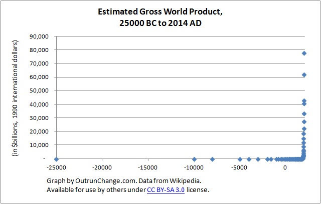
27,000 year time horizon – Check out the graph at top of this post for the estimated gross world product on a very long time horizon, specifically from estimates back in 25,000 B.C. through 2014 A.D.
Copyright notice: Graphs in this post are based on data in an article titled “Gross world product” by Wikipedia, which is licensed under CC BY-SA 3.0. As a result the following tables which are derived from this information are licensed for use by anyone under the same CC BY-SA 3.0 license. Any use of these graphs must in turn be distributed under the same license.
I will show the raw data at the end of this post.
With that 27,000 year time horizon, there is a radical turn in the 1900s, at which point the graph appears to goes from horizontal to straight up vertical.
That is too long of a time horizon to understand, so I broke it out into smaller blocks.
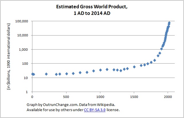
Last 2,000 years – To remove the many earlier millenniums of slow growth, time horizon was revised to 1 AD through now. Notice there is still a radical change in the 1900s. With the dramatic changes in the last 200 years, the line from earlier looks like it is flat, but it isn’t.
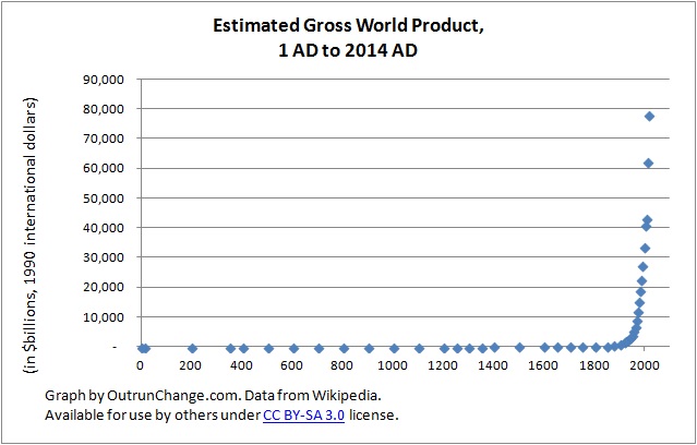
In fact, there are several times when large increases took place.
Earliest 24,000 years – First, let’s go back to the earliest time and lop off the later years.
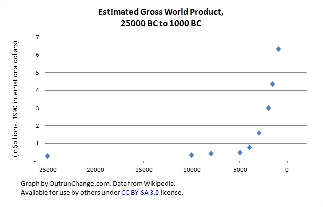
That shows a break out from the worst GWP, starting in 4000s BC. There was some visible growth in the 2000s and 1000s. Actually that is eight times as large in 1000BC as in 4000BC. On the other hand, that is probably coming off an ‘enjoy your dirt-with-a-bit-of-grain pancakes until you die in your late 20s‘ base.
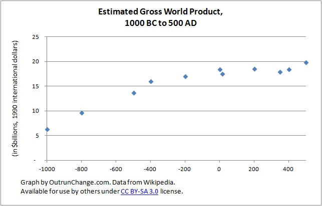
1000BC to 500AD – This time span covers the Roman Empire, New Testament era, and some of the Old Testament Era. This shows some growth, around 50% from 800BC to 400BC with meager growth for the next 900 years. Growth of 24.3% over 900 years is lousy. Works out to 0.14% a year; about a tenth of one percent annually.
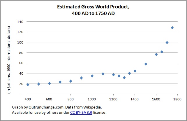
400 AD to 1750 AD – This shows some growth from about 700 through 1100, roughly doubling in that time. Oh, can you see the Black Death, which was at its peak in 1348 through 1350?
GWP took off after 1400, increasing to 2.9 times higher by 1750. This would bring us to the start of the Industrial Revolution, which began in Western Europe and slowly spread out from there.
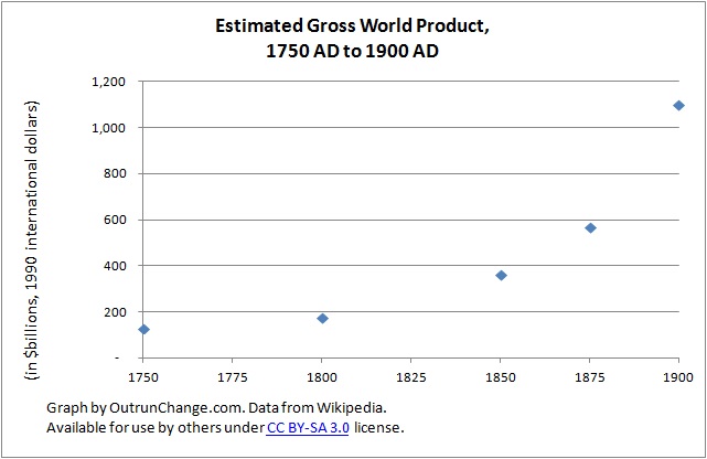
1750 – 1900 – Now let’s see the industrial revolution. From 1750 to 1850 saw an increase of 186%, nearly tripling GWP. From 1850 to 1950 there was a 1034% increase, getting GWP to 11.3 times higher in 1950 than 1850.
Two hundred year increase was 3080%, a runup from $129B intl$ to $4,082B intl$.
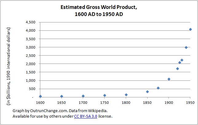
1600 to 1950 – Those dramatic changes in the 300 years before 1750 and 200 years after 1750 pale in comparison to the growth in global income in the 1900s. Rapid growth between 1875 and 1900 would correspond with rapid technological developments in the post-Civil War U.S.
Ponder the radical expansion in technology and wealth from cars and airplanes after the turn of the century. The Great Depression is visible and dramatic growth after WWII is visible (keep in mind all the brightest minds in the economics profession predicted a return to the depths of the Depression after the end of the war).
That is an 11.3 fold increase in the 100 years from 1850 to 1950. That will pale in comparison to the next change.
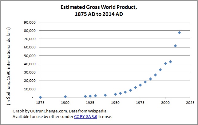
1875 to 2014 – The change to 1950 looks almost horizontal on this graph. Even after all the previous increases, the growth in worldwide production shows even more dramatic increase. The jump from 1950 to 2014 is 19 fold, a jump of over $73,000 billion international dollars (about $73T intl$). Not that it is meaningful, but that is an increase from 1 AD by a factor of 4,209 times.
1600 – 2014 – For a little longer time horizon, here is the graph for the last 400 years. Those times of dramatic growth before 1950 shrink into what seems to be a horizontal line.

The rate of change in the above graphs is too much to see on a longer time horizon, so I redrew the graphs on a log scale. Check it out.
Logarithmic scale 1 AD to 2014 AD – Now the data for the last 2000 years can actually be seen across the whole time span. There is dramatic growth across the 2000 years, but still a major change since 1950.
So, one final graph.
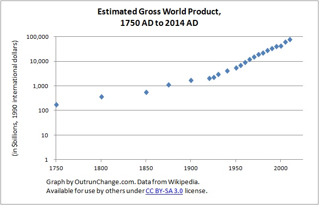
Logarithmic scale 1750 AD to 2014 AD – Here is a view of growing GWP since about the start of the Industrial Revolution. As dramatic as that growth is during the Industrial Revolution was, there is a bend in the curve starting about 1925.
Hope you enjoyed the tour of gross world product over the last 27,000 years.
Raw data – So that you could do your own graphs (or double-check mine), here is the raw data:
| Year | Real GWP ($ billions, 1990 intl$) | Compound annual growth rate |
| 2014 AD | 77,868[2] | |
| 2010 AD | 62,220 (est. 41,090 in 1990 U.S. dollars)[6] | |
| 2005 AD | 43,070 (est. 31,300 in 1990 U.S. dollars)[citation needed] | |
| 2000 AD | 41,016.69 | 4.04% |
| 1995 AD | 33,644.33 | 4.09% |
| 1990 AD | 27,539.57 | 4.14% |
| 1985 AD | 22,481.11 | 3.62% |
| 1980 AD | 18,818.46 | 4.43% |
| 1975 AD | 15,149.42 | 4.53% |
| 1970 AD | 12,137.94 | 5.87% |
| 1965 AD | 9,126.98 | 5.89% |
| 1960 AD | 6,855.25 | 4.77% |
| 1955 AD | 5,430.44 | 5.88% |
| 1950 AD | 4,081.81 | 3.12% |
| 1940 AD | 3,001.36 | 2.91% |
| 1930 AD | 2,253.81 | 1.40% |
| 1925 AD | 2,102.88 | 3.94% |
| 1920 AD | 1,733.67 | 2.29% |
| 1900 AD | 1,102.96 | 2.69% |
| 1875 AD | 568.08 | 1.84% |
| 1850 AD | 359.9 | 1.45% |
| 1800 AD | 175.24 | 0.62% |
| 1750 AD | 128.51 | 0.51% |
| 1700 AD | 99.8 | 0.40% |
| 1650 AD | 81.74 | 0.12% |
| 1600 AD | 77.01 | 0.27% |
| 1500 AD | 58.67 | 0.27% |
| 1400 AD | 44.92 | 0.21% |
| 1350 AD | 40.5 | 0.47% |
| 1300 AD | 32.09 | -0.21% |
| 1250 AD | 35.58 | -0.10% |
| 1200 AD | 37.44 | -0.06% |
| 1100 AD | 39.6 | 0.11% |
| 1000 AD | 35.31 | 0.11% |
| 900 AD | 31.68 | 0.23% |
| 800 AD | 25.23 | 0.07% |
| 700 AD | 23.44 | 0.12% |
| 600 AD | 20.86 | 0.05% |
| 500 AD | 19.92 | 0.08% |
| 400 AD | 18.44 | 0.06% |
| 350 AD | 17.93 | -0.02% |
| 200 AD | 18.54 | 0.03% |
| 14 AD | 17.5 | -0.43% |
| 1 AD | 18.5 | 0.04% |
| 200 BC | 17 | 0.03% |
| 400 BC | 16.02 | 0.16% |
| 500 BC | 13.72 | 0.12% |
| 800 BC | 9.72 | 0.21% |
| 1000 BC | 6.35 | 0.06% |
| 1600 BC | 4.36 | 0.09% |
| 2000 BC | 3.02 | 0.06% |
| 3000 BC | 1.59 | 0.07% |
| 4000 BC | 0.77 | 0.04% |
| 5000 BC | 0.51 | 0.01% |
| 8000 BC | 0.43 | 0.01% |
| 10,000 BC | 0.37 | 0.00% |
| 25,000 BC | 0.31 | 0.00% |
| 300,000 BC | 0.09 | 0.00% |
| 1,000,000 BC | 0.01 | – |
Source: Article titled “Gross world product” by Wikipedia licensed under CC BY-SA 3.0. All data and tables above which are derived from this information are in turn licensed for use under the same CC BY-SA 3.0 license.