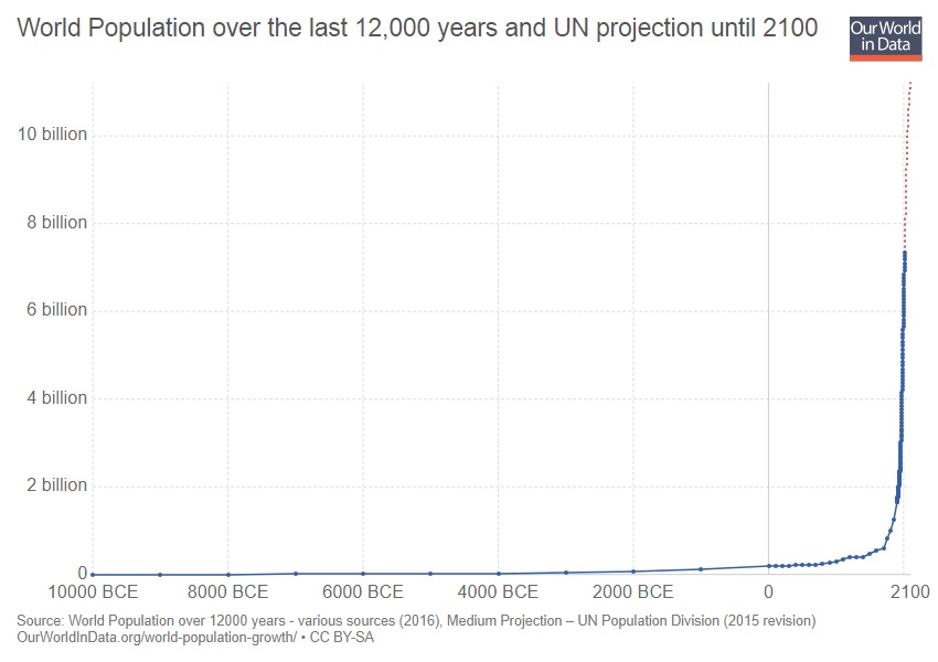
Our World in Data, the web site of Max Roser, visualizes data in amazing ways. Check out this graph of world population:
“World Population over the last 12,000 years and UN projection until 2100” by Our World in Data is licensed under CC BY-SA 3.0. The graphs which follow are derived from this information and are licensed for use by others under the same CC BY-SA 3.0 license.
Very cool. The dramatic expansion in the number of people is amazing.
The graph includes projections through 2100. I pulled out the projections and developed the following graph:
