Ridicule is the appropriate way to address the false idea that oil production follows a bell curve and at any moment production will drop off and head to zero. Gonna’ happen any hour now. It is an undisputed scientific certainty…
Only problem is the inconvenient truth that production has consistently blown out every prediction from the peak oilists. It’s almost like the entire concept is bogus.
8/11 – Ronald Bailey, author of The End of Doom, at Reason – Peak Oilers Shut Up Forever Please – One of the main apostles of Peak Oil precisely calculated the peak of oil production would be Thanksgiving Day in 2005 with an inevitable, unavoidable decline thereafter.
The absolute peak production, never to be seen again?
85M bopd.
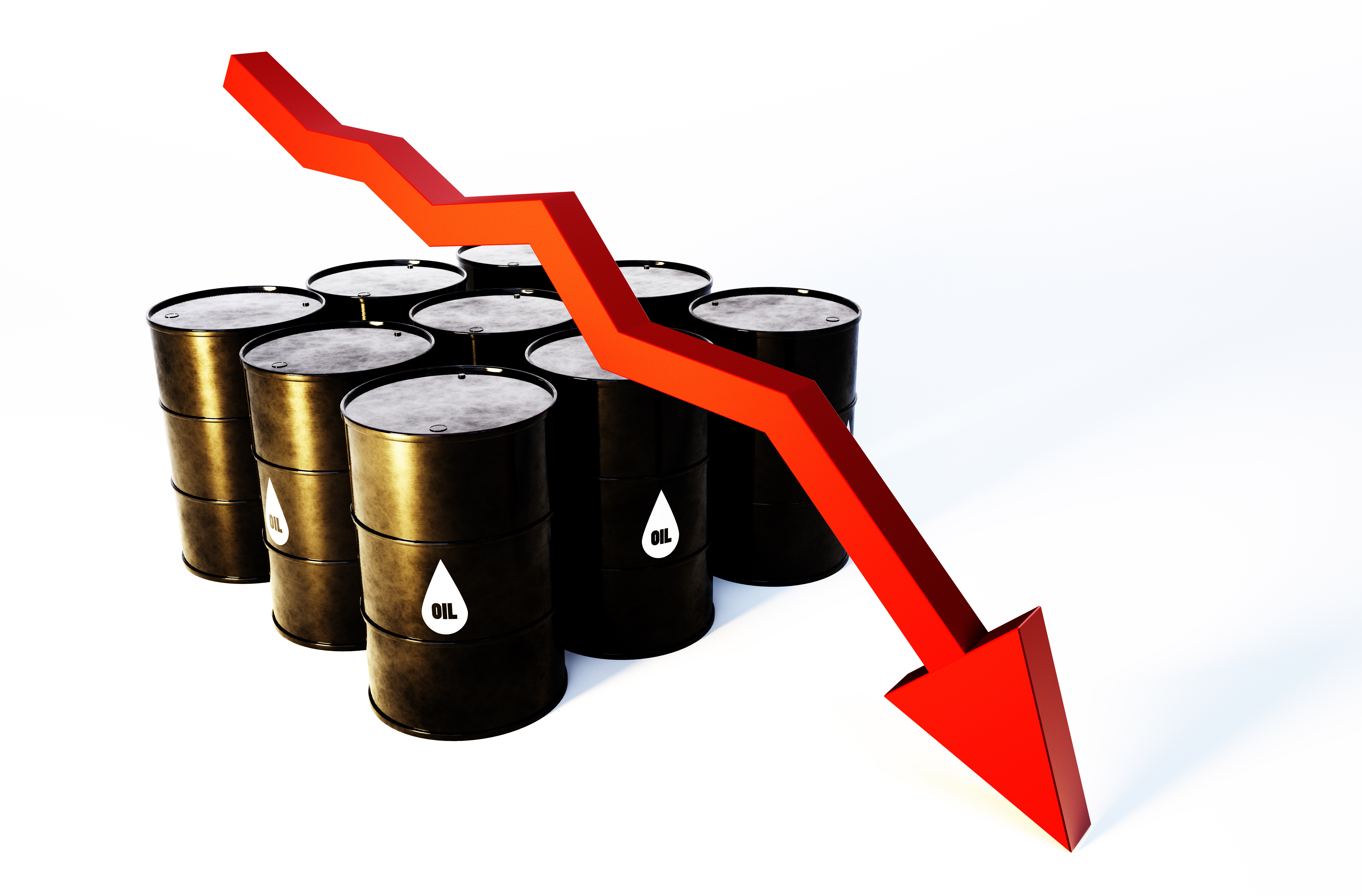
Please remember Peak Oil doctrine clearly states that production will drop the day after the peak and enter a bell shape curve decline, quickly heading to zero. Production graphs are supposed to have already resembled the image at the top of this post.
Petroleum liquids in July 2015?
96M barrels.
Um, that would be up 11M barrels. A 13% increase.
Another prediction busted.
Check out Glenn Reynolds observation:
8/11 – Instapundit linked to the above article saying Hey, remember when they were telling us we were at “Peak Oil?” Everybody point and laugh.
Just so you know this is not a straw man argument, please observe a few of the comments at the ‘point and laugh’ discussion continue to push Peak Oil doctrine.
Feel free to join in the laughter.
Just to prove the foolishness and falseness of Peak Oil doctrine, I checked out the International Energy Agency’s 2014 Key World Energy Statistics.
Page 6 shows total primary energy supply from all sources: coal, oil, natural gas, nuclear, Hydro, and the astoundingly thin sliver of renewables. Table is measured in Mtoe, which is million tons of oil equivalent.
Graph from 1971 through 2012 shows oil increasing. The amount in 2012 is larger than 1971. Below the graph is a pie chart. Here’s some info:
- 1973 2012
- 46.1% 31.4% – oil as percent of total primary energy supply
- 2,814 4,198 – my calculation of oil, in Mtoe
- 0.1% 1.1% – other as percent of total, which includes geothermal solar wind heat etc.
- 6 147 – my calculation of all other, in Mtoe
I think that total worldwide production of oil increasing by 49% from 1973 to 2012 rather persuasively proves yet again that Peak Oil doctrine is false.
Page 10 shows crude oil production in graph form. This would be without liquids, I think. Production dropped for a few years after about 1979 and then started rising. Production didn’t return to the 1979 level until about 1992 or so.
Production increased for about 26 of the 31 years from 1982 through 2013.
So much for the long string of peak dates.
Back to Mr. Reynolds’ suggestion on how to deal with Peak Oil – I point as often as I can. I laugh as hard as I can.