(Photo by James Ulvog)
Carpe Diem has been running a recap of the best-of graphs from 2014. Last week the focus was energy: My Top Ten Energy Charts of the Year For 2014.
Here are some of my favorites. All graphs used with permission of Carpe Diem.
If you have just tuned into the energy revolution, look at these graphs to see how much things have changed in the last decade.
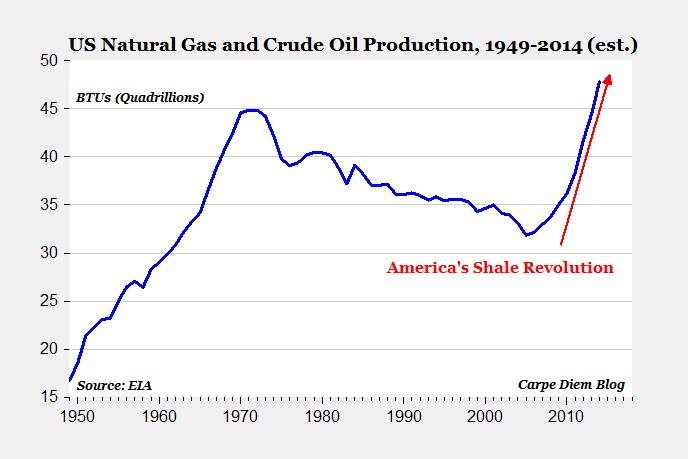
Check out the total U.S. production of crude oil and natural gas. That is a great proxy for the shale revolution.
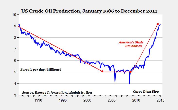
Look at the crude oil only production graph.
Very cool.
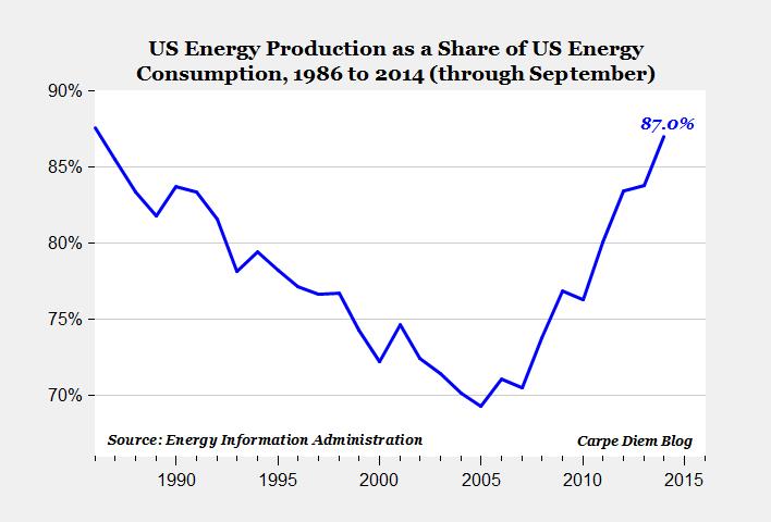
The U.S. has been producing a growing percentage of the oil we use. One of the disruptions I read of recently was that Nigeria used to export a million barrels a day to the U.S. Now? None. Zero.
Check out the portion of our consumption we produce:
That’s money staying in the U.S., in the pockets of our roughnecks, drillers, refiners, railroads, landowners, and severance tax funds.
Look at the production from the U.S. and Saudi Arabia and you will see why the Saudis want to shut down drilling in Bakken, Eagle Ford, and Permian.
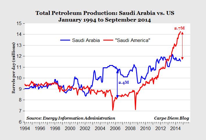
That graph shows the amount of sales the rest of the world is losing in the U.S.
Now look at the production in the three largest shale oil plays: Eagle Ford, Permian, and the one I follow closest, Bakken.
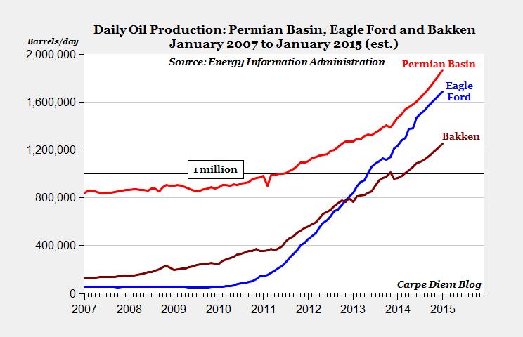
All three fields are seeing radical growth.
Very, very cool. A huge revolution. No wonder Saudi Arabia wants to shut us down.
Again, all graphs used with permission.
Oh, do I really need to ask again? I suppose so… What Peak Oil?