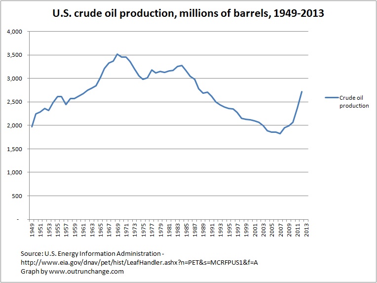
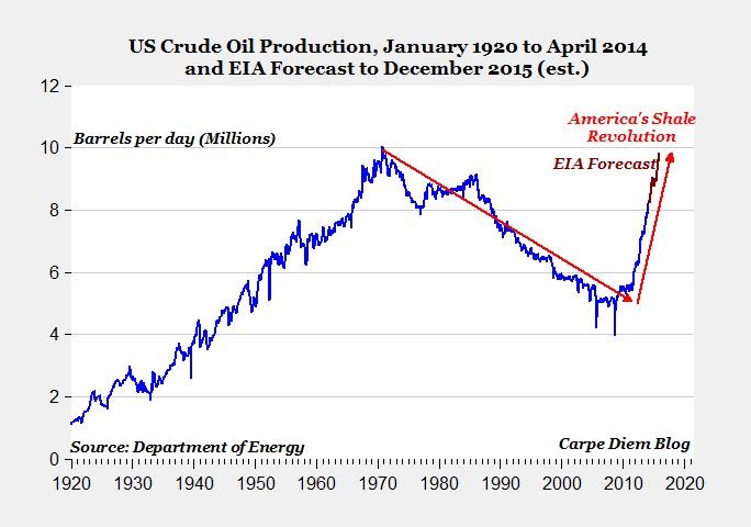
Update: Some commenters on the ‘net did not agree with a graph that combines gas and oil. Fair point. I’ll redraw the graph to include only crude oil.
The new graph does not change any comment made in this post. It stands as is.
Peak oil is still a failed concept.
Here is the new graph:

Again, here is the main question: Where is the inverted V drop after the peak that mirrors the runup to the high point?
Answer: It isn’t there.
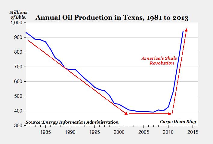
2nd Update: I appreciate folks pointing out the error of my ways. Further research produced the above graph which makes the point yet again. I also looked at natural gas production.
The fail of Dr. Hubbert’s theories is even more extremely illustrated by graphing natural gas production. Comparing actual to his predictions is staggering. Another post on Monday.
Two busted Hubbert theories from one post. Peak Gas is even more of a fail than Peak Oil.
3rd update: Further discussion of the Peak Oil graph on the following post.
Original post:
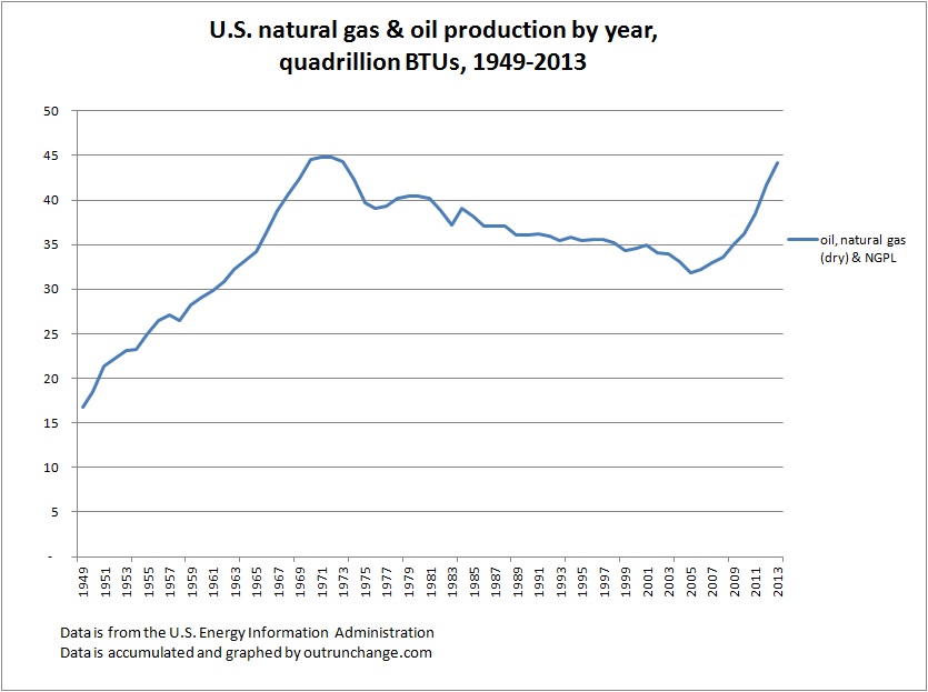
Saw a graph containing production of oil and gas in the U.S. since 1950. Since that one is copyrighted, decided to make my own.
Check out this graph of the amount of crude oil, natural gas (dry), and NGPL from 1949 through 2013:

Now, please look for the permanent, inevitable decline trending to zero after the never-to-be-achieved-again peak oil point of 1970. Also look for the inverted-V shaped drop after the peak that mirrors the runup.
Continue reading “What Peak Oil? – #35”
