While researching for my post, Encore question: What Peak Oil – #36, I browsed a bit more of Dr. M. King Hubbert’s 1956 paper, Nuclear Energy and the Fossil Fuels, which you can find here.
In addition to a precise calculation of the total crude oil that will be extracted through 2050 from Texas, the U.S. in total, and from the entire planet, he also made some calculations for natural gas.
In Figure 22 on page 32, he calculated the production curve of natural gas in the U.S. through 2075, at which point production is indistinguishable from zero. The calculations are to three significant digits.
The graph is based on the same logic and analysis as Peak Oil. Namely that the total amount of a resource that will ever be extracted can be calculated and the production curve graphed with reasonable accuracy. There will be a peak followed by a slow, inevitable, unavoidable decline to near zero. When the production turns a corner at what appears to be the peak, 50% of the total that will ever be extracted has been pulled, which means roughly the same amount will be extracted in the future.
That concept applied to natural gas is a complete failure for the same reasons as Peak Oil is a failure.
The conceptual reasons are discussed in the series of posts addressing What Peak Oil?
A graph showing the failure of Peak Natural Gas is more dramatic that the graph of Peak Oil.
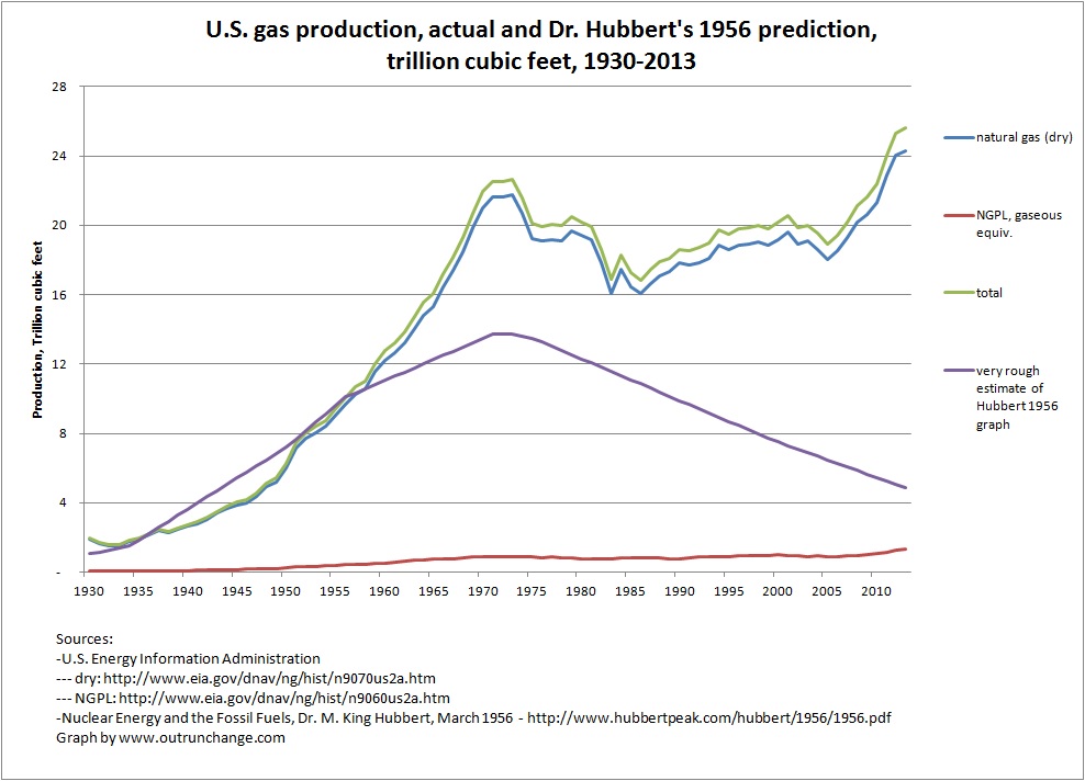
Graph of actual production and Dr. Hubbert’s prediction.
I pulled the natural gas (dry) and NGPL data from EIA for 1930 through 2011.
I don’t have the raw data for the curve Dr. Hubbert drew and don’t have the software to calculate the curve.
So I pulled approximations from the graph in Figure 22. Made estimates for 1925, 1934, 1950, 1956, 1971, 1972, 1973, 1975, 2000, and 2025. Then I interpolated the years between those data points.
The resulting graph I drew is visually comparable to Dr. Hubbert’s graph in Figure 22. Specifically, the 1956 data matches, the peak is around 14T in the mid-‘70s, and the 2000 data point is below 8T.
If you have more accurate data, let me know and I’ll redraw the graph. As a rough comparison, I’ll bring in another graph in a moment.
So, here is the comparison of actual production to my rough redrawing of Dr. Hubbert’s prediction:

Please, please don’t take my word for it. Please check Figure 22 for yourself.
Can you say busted?
Continue reading “What Peak Natural Gas? – #1”

